
From Sketch to Photoreal: FLUX.2 and the New AI Sketch Workflow
On this page
Share
Modern image models just crossed an inflection point. With FLUX.2 arriving as open weights and bringing multi‑reference inputs, stronger prompt adherence, and 4MP editing, sketch↔image workflows are no longer a parlor trick—they’re becoming reliable, production‑ready pipelines. This article synthesizes what’s new, why it matters, and how to put it to work today.

- Why FLUX.2 Changes Sketch↔Image Workflows
- Hands‑On Workflows and Best Practices
- Model Selection and Cost–Performance
- Quality Measurement and Debugging
- FAQ
- Conclusion
Why FLUX.2 Changes Sketch↔Image Workflows
The core shift: a sketch is no longer just a style—it’s a control interface. FLUX.2’s multi‑reference and higher‑fidelity editing turn your doodles, wireframes, and line art into strong conditioning signals, while the model’s improved prompt following makes complex, structured instructions dependable.
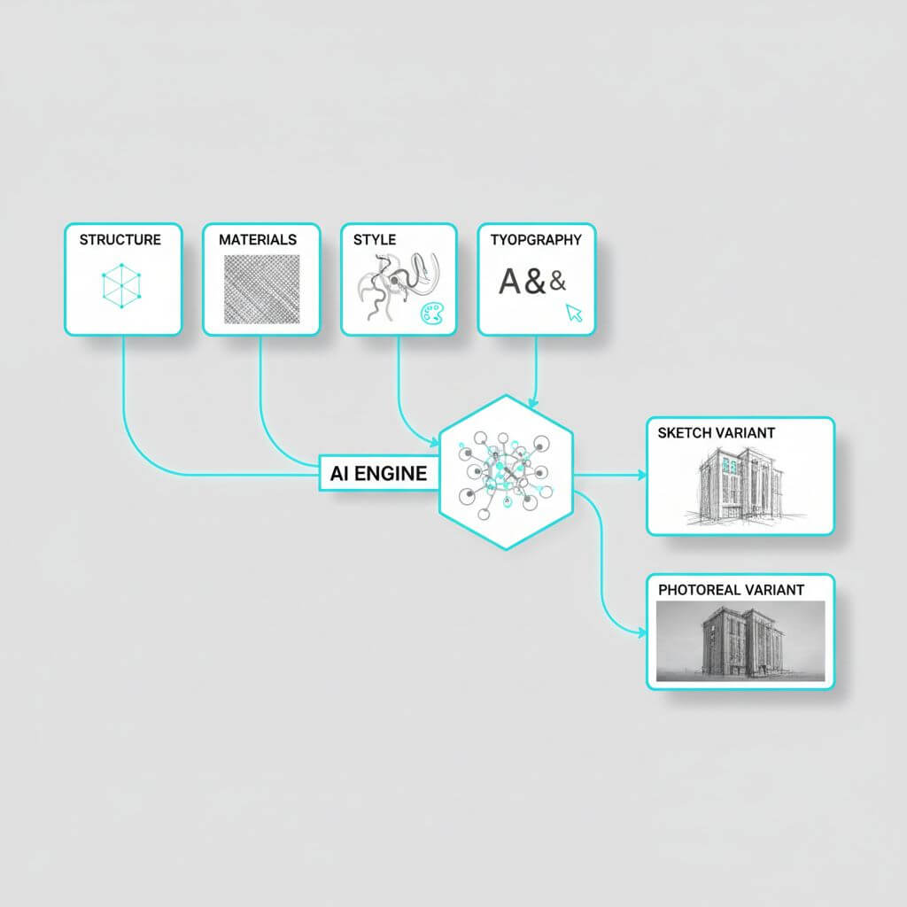
Multi‑reference as a visual program
FLUX.2 can consider up to 10 reference images. Instead of expecting one image to do everything, think in roles:
- Structure references: pose, composition, camera geometry, rough lighting.
- Material references: textures, fabrics, skin, metals, foliage.
- Style references: palette, lens traits, grain, render engine vibe.
- Typographic reference: a single, high‑contrast layout for text areas and baseline grid.
Order references by importance and keep them visually clean. Treat the set as a “visual program” where each image contributes one job, reducing conflicts.
Prompt reliability: from vibes to constraints
The release emphasizes better compliance with complex, structured prompts. Practical patterns:
- Declare role then constraints: “UI mockup, dark theme: 12‑column layout, 24px gutters, H1 = ‘Travel Planner’, buttons: ‘Plan’, ‘Explore’.”
- Prefer enumerations over prose when precision matters.
- Isolate critical tokens with quotes and avoid ambiguous punctuation.
- Use negative constraints for failure modes: “no extra hands, no background text.”
High‑resolution (4MP) editing and faithfulness
Native 4MP editing reduces softening, preserves micro‑texture, and stabilizes edges. When upscaling after the fact, fine typography often blurs; editing at high resolution upfront keeps text and line art crisp.
Typography and layout rendering
Better text rendering unlocks infographics, UI, and posters. Pair a clean layout mock (even low‑fi) with explicit content strings. Use one dedicated reference for type to avoid style contamination.
Hands‑On Workflows and Best Practices
Below are battle‑tested recipes you can adapt. Parameters refer to typical text‑to‑image/image‑to‑image controls; exact names vary by UI.
Photo → Pencil Sketch
Goal: crisp lines, controlled shading, preserved identity.
- Pre‑process (optional): run an edge detector (Canny/LineArt) to obtain a structure mask.
- Image‑to‑image strength: 0.25–0.45 to keep geometry but allow stylization.
- Prompt: “pencil sketch, clean linework, cross‑hatching, high contrast, white background.”
- Negative prompt: “smudges, watercolor, color.”
- Seed: fix for reproducibility; vary only if edges look over‑simplified.
Tip: If hair or fabric loses texture, add a material reference (e.g., pencil texture on hair swatches) with low weight.
Sketch → Realistic Image
Goal: preserve layout while adding believable materials and lighting.
- Use the sketch as a primary structure reference.
- Add 1–2 material references (skin/fabric/metal) and 1 lighting reference (e.g., soft daylight, studio rim‑light).
- Strength: 0.35–0.6 depending on sketch fidelity. More detailed sketches tolerate higher strength.
- Prompt with constraints: camera, focal length, lighting, render realism, color temperature.
- Negative: “no extra limbs, no text artifacts, no watermarks.”
Tip: If faces drift, introduce a tight crop reference of the face with higher priority.
Multi‑reference style mixing
- Assign roles. Example set: [pose board] + [skin macro texture] + [fabric sample] + [color palette swatch] + [lens look].
- Reduce redundancy; overlapping cues fight each other.
- Start with lower overall image‑conditioning scale and increase gradually to avoid over‑constraint.
Typography/UI/Infographics
- Provide a layout PNG with clear boxes and baseline grid; keep text high‑contrast.
- Prompt with exact strings; short is better. For long paragraphs, generate glyph blocks first, then replace with real text in editing passes.
- Iterate: layout pass → content pass → polish pass (shadows, reflections, micro‑detail).
4MP editing: clean composites
- Mask edges softly (3–5 px feather) to avoid seams.
- Keep noise strength modest (0.2–0.35) for local edits.
- For sky replacements or large areas, increase strength in the masked region only.
- Re‑run a micro‑sharpening pass if typography softens.
Tools and setup (for non‑coders)
If you prefer a ready UI for image↔sketch conversions and upscaling, check out Sketch To (https://www.sketchto.com/) as one of several options; it offers a standard model with trial credits and an upgraded pro tier for higher realism.

Model Selection and Cost–Performance
FLUX.2 arrives in several variants with distinct trade‑offs:
- pro: production‑grade quality, strong prompt adherence, fast and cost‑efficient at scale.
- flex: full control over steps and guidance for developers who need deterministic, tunable runs.
- dev (open weights): the most capable open model for text→image and image editing with multi‑input support, ideal for on‑prem, research, and privacy‑sensitive workflows.
- klein (incoming): distilled, Apache‑licensed, smaller footprint—attractive for edge and mobile.
Heuristics:
- Enterprise pipelines: start pro or flex for throughput and PMF; migrate parts on‑prem with dev when privacy or latency demands it.
- Designers and students: dev for cost and openness; switch to pro when typography fidelity or turn‑around time is critical.
- Edge/embedded: revisit klein upon release for footprint‑constrained deployments.
Quality Measurement and Debugging
Make evaluation boring and automated:
- Structure preservation: keypoint/pose or SSIM against the sketch/edge map.
- Edit faithfulness: LPIPS or DINO similarity in masked regions vs. source.
- Text quality: OCR accuracy and character error rate (CER).
- Style adherence: CLIP directional similarity from a style board.
- Human panel: quick 5‑point MOS for realism and typography legibility.
Common failure modes and fixes:
- Ghost limbs or props: raise negative constraints; reduce reference redundancy.
- Aliased text: push native 4MP editing earlier; simplify fonts; increase contrast.
- Over‑stylization: lower guidance; reduce material references; lock seed.
- Flat lighting: add a lighting‑only reference; specify key/fill/rim ratios.
Repro tips:
- Fix seeds; vary one knob at a time.
- With flex‑like controls, bracket steps (e.g., 20/28/36) and guidance (2.5/4/6) to map a stability frontier.
- Save the exact reference set and order—they matter.
FAQ
- Do I need multi‑reference for every task?
- No. Use it when goals conflict (e.g., strict pose + specific fabric + lens look). One clean reference beats three noisy ones.
- How do I keep logos and typography accurate?
- Provide a pristine vector or high‑res raster reference, generate at native 4MP, and keep strings short. Consider a two‑pass method: layout first, content later.
- What’s the safest way to do large edits?
- Work in tiles or regions with soft masks, keep moderate noise strength, and re‑blend with a low‑frequency color match.
- Can I run open weights locally?
- Yes, with the dev variant, assuming you have sufficient GPU memory and a compliant runtime.
- How do I avoid dataset‑style “leakage” in results?
- Reduce style weight; provide explicit palette and lens specs; avoid ambiguous style descriptors.
Conclusion
FLUX.2’s multi‑reference, improved instruction following, and 4MP editing elevate sketches from rough hints to reliable control signals. Whether you’re turning photos into elegant pencil work, or pushing sketches toward photoreal UI and product renders, the combination of structured prompts, clean references, and high‑res editing can deliver consistent, production‑ready results. Treat your references like a program, measure quality automatically, and iterate with intent—the rest is execution.
Transform Your Images with AI
Turn sketches into stunning images, remove backgrounds, swap faces, and more — all powered by AI.
Try Sketch To FreeShare
Sketch to Art
Tech writer covering AI tools, image processing, and creative workflows.
Related Articles

Knitted Doll AI Prompt: 7 Templates That Work
Use this knitted doll AI prompt guide to turn photos or sketches into cozy yarn dolls. Includes 7 templates, material words, and fixes.

AI Visual Reference for Landing Page Design
Use an AI visual reference for landing page design to turn rough sketches into clearer prompts, fewer retries, and stronger drafts.

Local AI Image Generator vs Online Sketch Tools
A local AI image generator gives you privacy and offline use; online sketch to image AI tools win on speed and polish. Full 2026 comparison.