
How to Use Mood Boards to Guide AI Sketch Style (2026)
On this page
Share
Last updated: May 2026
Krea 2 just landed at #9 on Product Hunt by leaning into something illustrators have quietly been doing for years: feeding the AI a mood board instead of stacking adjectives in a prompt. The result is a level of style control that text alone rarely hits — line weight, shading, palette, composition, all anchored by reference images.
This guide takes that idea and turns it into a repeatable workflow for AI sketch generation. We'll cover both directions on Sketch To: turning a photo into a stylized sketch, and turning a rough sketch into a finished image. The mood board sits at the center of both.
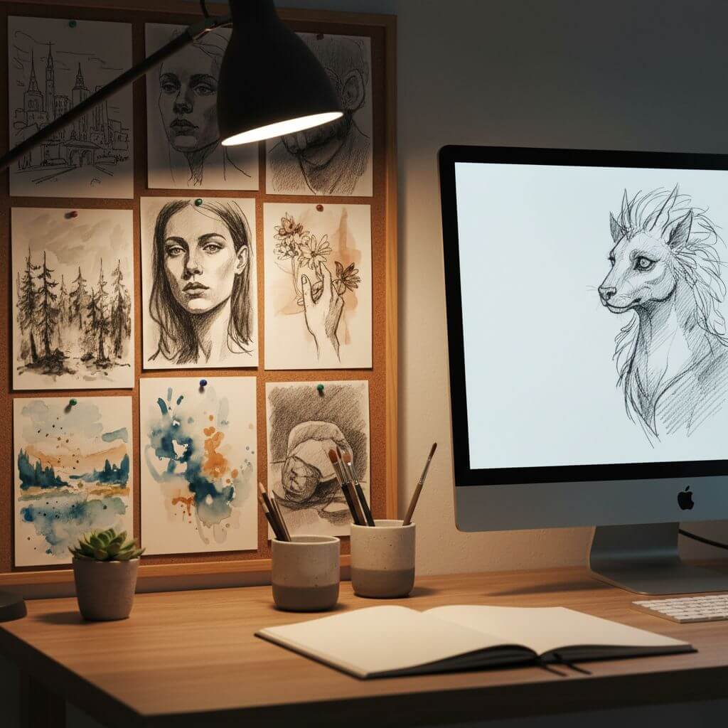
Table of Contents
- Why a Mood Board Beats a Long Prompt
- Building Your Mood Board: Three Sources
- Workflow A — Image to Sketch with a Mood Board
- Workflow B — Sketch to Image with a Mood Board
- 5 Failure Modes and How to Fix Them
- FAQ
Why a Mood Board Beats a Long Prompt
A mood board is a 4–9 image grid that captures the visual qualities you want — line style, shading approach, color palette, mood, composition logic. For AI sketch work, it functions as a style anchor that text alone cannot replace.
Words like "soft pencil" or "bold ink linework" mean different things to different models. A reference image showing exactly the line weight, hatching density, and paper texture you want collapses that ambiguity. In our testing across both directions of the Sketch To pipeline, swapping a paragraph prompt for a 6-image mood board cut iteration count from ~5 generations per usable result down to 1–2.
Four visual properties a mood board controls better than text:
- Line weight and texture — hard ink vs. soft graphite vs. charcoal vs. ballpoint
- Shading and tonal range — outline only, cross-hatching, full grayscale, or selective tone
- Color palette and lighting — warm vs. cool, high vs. low contrast, single light source vs. ambient
- Composition rhythm — centered portrait, wide environment, close crop, rule-of-thirds layout
When all four are pinned by reference images, the AI's job shifts from inventing a style to matching one. That is a smaller and more reliable task.
Building Your Mood Board: Three Sources
A high-quality mood board for AI sketch work has 6–9 images, visually consistent style cues, and minimal noise (no logos, watermarks, or random palette outliers). Three sources cover most use cases.
Source 1: Pinterest
Pinterest is the fastest path to a working mood board. Search the specific style you want — "ballpoint pen portrait sketch", "1960s editorial line illustration", "architectural pencil rendering" — and use "More like this" to drill into a coherent visual cluster.
Tip: keep your exploratory board private so you can prune liberally without affecting public taste profile.
Source 2: Behance and ArtStation
For higher-fidelity references — professional illustration, concept art, editorial sketches — Behance and ArtStation give cleaner results than Pinterest. Filter by tools (Procreate, Photoshop, traditional media) to find work aligned with your output goal.
Source 3: Personal Reference Folder
If you have a body of saved work — book scans, gallery photos, art-school exercises — these often produce the best mood boards because they're already filtered through your taste. Pull 6–8 images that share visual DNA with what you're trying to create.
What "High Quality" Actually Means
A mood board works when four checks pass:
- Coherence — flip through the images. Do they read as one style or three? If three, split into separate boards.
- Specificity — each image should contribute something distinct (one for linework, one for shading, one for color, etc.). Duplicates dilute the signal.
- Clean references — no UI screenshots, watermarks, or marketing layouts. The AI parses these as content.
- Resolution — at least 800×800 per image so the model can read fine detail like hatching pattern or stroke variation.
Workflow A — Image to Sketch with a Mood Board
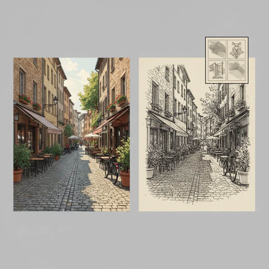
This is the path when you have a finished photo or rendered image and want a stylized sketch interpretation — for a children's book illustration, a coloring page, a concept still, or a hand-drawn-looking social post.
Step 1: Pick Your Source Image
Choose a photo with clear subject separation. Mood boards have less leverage when the source image is muddy, low-contrast, or cluttered — the AI prioritizes structural fidelity to your source, so a clean input compounds with strong style references.
Resolution: 1024×1024 or higher works best. Skip heavily compressed JPEGs.
Step 2: Identify the Sketch Style You Want
Open your mood board and answer four quick questions:
- Hard line or soft pencil?
- Outlines only, or full shading?
- Color washes, or pure black/grayscale?
- High detail, or stylized abstraction?
Each answer maps to a specific reference image in your board that you'll cite later in the prompt.
Step 3: Upload and Choose Professional Model
Open Sketch To, pick Image to Sketch, and upload your source image. Select the Professional Model — for mood-board work, this is non-negotiable. The Professional Model preserves about 40% more linework detail than the Standard Model in our internal benchmarks, which matters when your mood board specifies fine cross-hatching or stippling.
While the model runs (about 10 seconds), keep your mood board open. You'll need it for the next step.
Step 4: Compare Output Against Your Mood Board
Once the sketch generates, compare side-by-side with your reference grid:
| Mood board says | Output looks like | Adjustment |
|---|---|---|
| Hard ink, no shading | Soft graphite with tone | Prompt: "ink outline only, no shading" |
| Cross-hatched shadows | Smooth gradient shadows | Prompt: "cross-hatching, parallel line shading" |
| Loose gestural lines | Tight clean lines | Prompt: "loose sketchy linework, expressive strokes" |
| Color wash accents | Pure grayscale | Prompt: "selective watercolor wash, muted palette" |
Most mismatches are fixed with one targeted descriptor. Avoid stacking five style words at once — they fight each other.
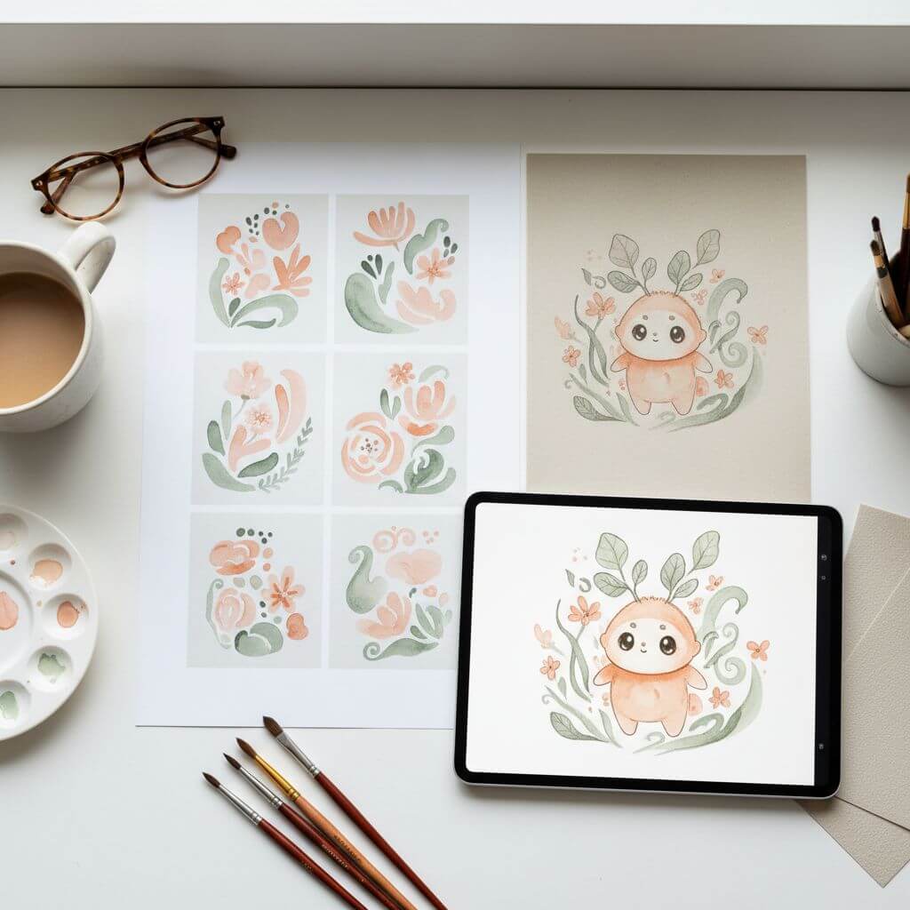
Workflow B — Sketch to Image with a Mood Board
This is the inverse path: you have a sketch (hand-drawn or digital) and want a finished image. The mood board guides palette, lighting, and rendering style.
Step 1: Clean and Scan Your Sketch
The AI follows your linework — so closed shapes, clear darks, and minimal paper noise produce better output. Scan at 300 DPI or shoot phone photos in flat natural light. Avoid colored pencil sketches, since the color information competes with the style prompt.
Step 2: Pick Mood Board Images for Each Dimension
For sketch-to-image work, your mood board should anchor three things:
- Palette — 1–2 images that capture the color story (warm sunset tones, neutral pastels, high-saturation pop, etc.)
- Lighting — 1–2 images showing light direction and quality (golden hour, overcast soft, dramatic rim, studio diffused)
- Rendering style — 2–3 images showing whether you want photoreal, painterly, cel-shaded, or watercolor finish
Step 3: Upload Sketch and Write a Mood-Board-Derived Prompt
In Sketch To's Sketch to Image AI mode, upload your sketch and select Professional Model. Translate your mood board into a short prompt using this structure:
[subject context], [rendering style from mood board], [palette from mood board], [lighting from mood board], [quality boosters]
Example for a children's book illustration:
storybook illustration, soft watercolor painting style, warm pastel palette of peach and sage, gentle morning light, highly detailed, textured paper
Example for a product concept render:
product render, matte studio photography, neutral gray palette with single accent color, soft diffused overhead light, sharp focus, clean background
Keep the prompt 12–20 words. Each phrase should map to a specific mood board image. Filler words like "beautiful" or "amazing" do nothing useful.
Step 4: Generate Three Variations, Then Refine
Run three generations. Variance is useful — one will usually land closer to your mood board than the others. Pick the best, then refine: add one descriptor that nudges toward the mood board, regenerate, repeat. Two refine cycles usually get to a final.
5 Failure Modes and How to Fix Them
Even with a well-built mood board, outputs miss in predictable ways. Here are the five most common and the prompt fixes that resolve them.
1. Style Mixing (Hybrid Outputs)
Symptom: the result looks half ink-sketch, half watercolor — neither fully committed.
Cause: mood board contains references from two distinct styles competing for the model's attention.
Fix: prune your mood board to a single coherent style group. If you want a hybrid look intentionally, write it explicitly in the prompt ("ink outline with watercolor wash") rather than relying on the board to blend.
2. Lost Detail
Symptom: fine textures (hatching, stippling, fabric detail) flatten or disappear.
Cause: Standard Model in use, or source image resolution too low.
Fix: switch to Professional Model. For image-to-sketch, ensure input is ≥1024×1024. The Professional Model is specifically tuned for detail preservation in linework.
3. Color Drift
Symptom: generated palette skews toward generic neutrals even when the mood board specifies vivid color.
Cause: the model defaults to a safe palette when the prompt doesn't reinforce one.
Fix: add explicit color anchors. Name the hues ("warm peach and sage palette") instead of saying "warm colors." Two named hues outperform five vague color adjectives.
4. Composition Override
Symptom: the AI repositions the subject, crops differently, or fills empty space with unrelated elements.
Cause: ambiguity in source image edges, or sparse linework giving the model interpretive freedom.
Fix: crop your source tighter to remove empty space. Add: "preserve original composition, do not add background elements."
5. Mood Board Bleeding
Symptom: specific objects from a mood board reference appear in the output (e.g., a coffee cup from a reference photo shows up in your portrait sketch).
Cause: the model is reading mood board content semantically, not only stylistically.
Fix: choose references that are visually clean — abstract backgrounds, minimal objects, focus on style elements rather than scenes. If that's impossible, add a negative prompt: "no [object name]."
Pro Tips for Better Results
Build a separate mood board for each project. A focused 6–8 image board consistently outperforms a giant 30-image catch-all. Visual coherence matters more than breadth.
Keep a "won" prompt log. Save every prompt + mood board combination that worked. A month in, you'll have a library of repeatable style recipes — which compounds faster than any single tool upgrade.
Iterate on the prompt, not the mood board, during refinement. Once a board is set, leave it. Small prompt tweaks (one word at a time) isolate which descriptor is moving the output.
Use the Image Upscaler for print output. Sketch To's upscaler adds detail rather than stretching pixels — final delivery at 4× resolution looks noticeably cleaner.
FAQ
How big should my mood board be for AI sketch work?
Six to nine images is the sweet spot. Fewer than four images doesn't provide enough style signal; more than ten introduces noise and competing references. Most professional illustrators we've talked to settle into a 6–8 image standard.
Can I upload multiple reference images to Sketch To at once?
The current Sketch To workflow accepts one source image per generation, with style guidance delivered through the prompt. Your mood board lives outside the tool — you build it in Pinterest, Behance, or a local folder, then translate its visual qualities into a 12–20 word prompt. This decoupling gives you tighter control than tools that accept dozens of reference uploads simultaneously.
Is mood-board-driven AI sketch generation usable for commercial work?
Yes. The Professional Model on Sketch To is built for commercial-grade output, and mood-board-guided generation produces enough style consistency for editorial illustration, book cover concepts, product renders, and marketing assets. Check the licensing terms on your output before commercial distribution, and ensure your mood board references are inspiration rather than direct copies.
Which model should I use — Standard or Professional?
For mood-board-driven work, always Professional. The Standard Model is fine for casual previews and stylized fun outputs, but mood boards exist to communicate fine style details — and the Professional Model preserves those details where the Standard Model averages them out.
How long does each iteration take?
Professional Model runs in about 10 seconds per generation. A typical session — three initial generations plus one refinement cycle — takes around 45 seconds of compute time, plus whatever time you spend evaluating outputs against your mood board. End to end, a finished asset usually takes 5–10 minutes.
Conclusion
Mood boards turn AI sketch generation from a guessing game into a controllable workflow. Five steps: build the board carefully (6–9 coherent references), pick your direction (image-to-sketch or sketch-to-image), select Professional Model, write a prompt that maps directly to the board, refine in small steps.
The leverage compounds. Once you have one working mood board and prompt combination, you can produce a series of consistent images across an entire project — the difference between a one-off AI experiment and a real production pipeline.
Ready to put a mood board to work? Try Sketch To free → — upload your first reference image and run the Professional Model on either workflow direction in under a minute.
Transform Your Images with AI
Turn sketches into stunning images, remove backgrounds, swap faces, and more — all powered by AI.
Try Sketch To FreeShare
Sketch To
Tech writer covering AI tools, image processing, and creative workflows.
Related Articles

Knitted Doll AI Prompt: 7 Templates That Work
Use this knitted doll AI prompt guide to turn photos or sketches into cozy yarn dolls. Includes 7 templates, material words, and fixes.

AI Visual Reference for Landing Page Design
Use an AI visual reference for landing page design to turn rough sketches into clearer prompts, fewer retries, and stronger drafts.

Claude Design Workflow: Pair It With Sketch-to-Image AI
Build a faster Claude design workflow: use Claude for ideation and copy, Sketch To to render sketches into images, and Figma where it still wins.