
AI Visual Reference for Landing Page Design
On this page
Share
Last updated: June 19, 2026
You ask an AI builder for a landing page, wait a minute, and get a page that is almost right: the hero is too tall, the proof section feels generic, the image crop fights the headline, and the pricing cards look like they came from another site. You can keep rewriting the prompt, or you can give the model a better visual target before it starts.
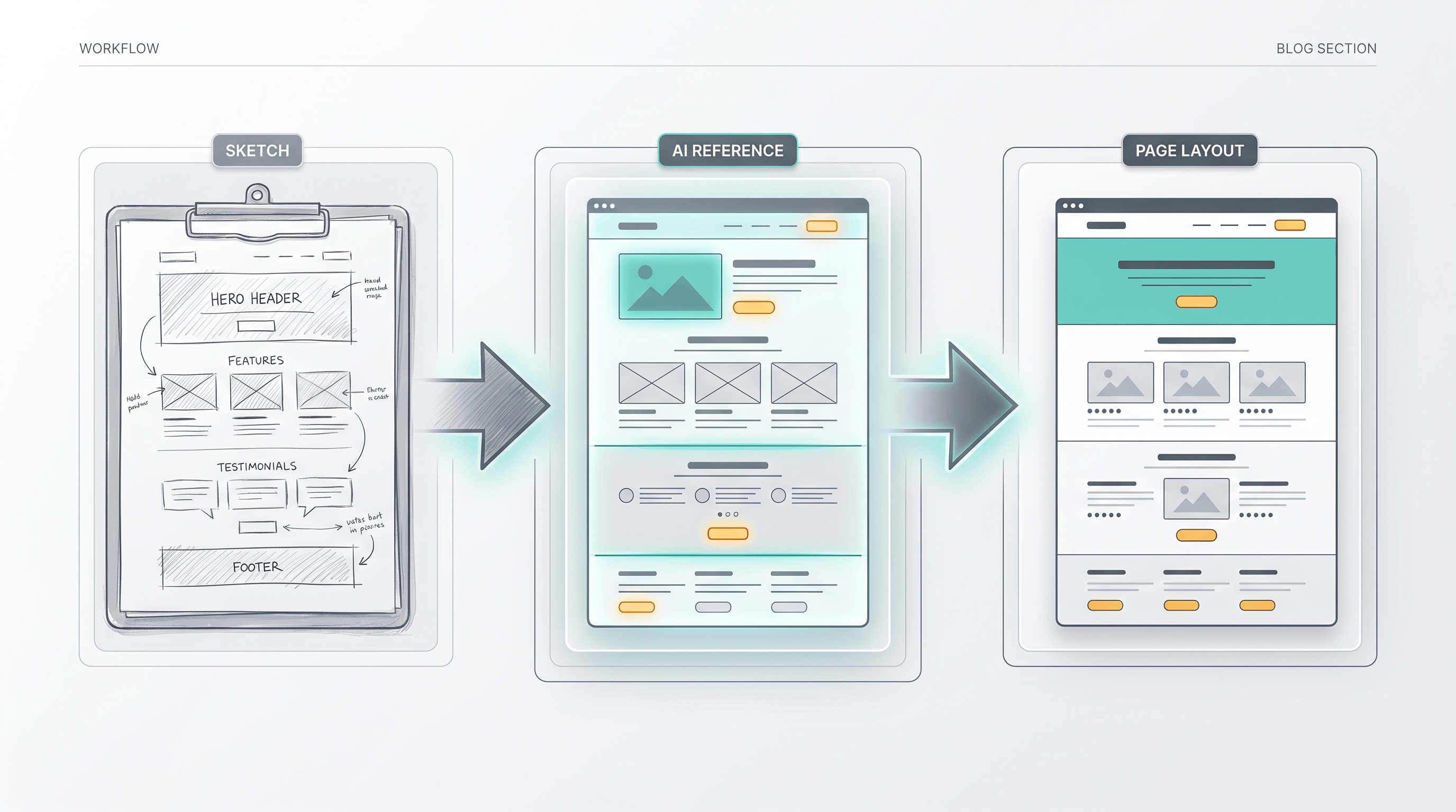
This guide shows how to create an AI visual reference for landing page design before you ask an AI coding or image model to build the page. The workflow starts with a rough sketch or wireframe, turns it into a cleaner visual reference, and uses that reference to reduce design trial and error.
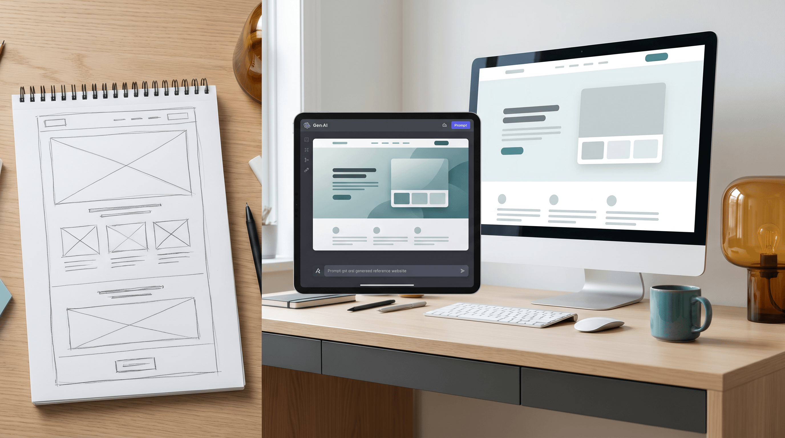
Table of Contents
- Why use an AI visual reference for landing page design?
- What makes a strong visual reference?
- Step-by-step guide
- Prompt template
- Pro tips for better results
- When not to use a visual reference
- FAQ
- Conclusion
Why use an AI visual reference for landing page design?
An AI visual reference for landing page design gives the model spatial facts that prose describes poorly: section order, visual weight, image position, negative space, and component density. It turns "make this look modern" into a visible target, which usually means fewer prompt rewrites, fewer rejected drafts, and a clearer first version.
The June 19, 2026 Daily Digest summarized a Kimi K2.7 Code vs Claude Fable 5 landing-page experiment: Kimi reportedly became much cheaper per iteration when paired with high-quality visual references, with the digest noting about 1/16 the cost of Claude Fable in that setup. Treat that as one public experiment, not a universal benchmark, but the lesson is practical: visual references can move cost from "model guesses repeatedly" to "creator clarifies once."
Official Kimi K2.7 Code documentation points in the same direction. Kimi describes K2.7 Code as a long-context coding model with 256K context support, visual input formats such as PNG, JPEG, WebP, and GIF, and about 30% lower "overthinking" than K2.6 in external benchmark evaluations. When a model can read images and code, the reference image becomes part of the specification, not decoration.
There is also a GEO reason to be specific. The KDD 2024 paper "GEO: Generative Engine Optimization" found that content changes such as adding citations and statistics can increase visibility in generative-engine responses by up to 40%. The same principle applies to prompts: models respond better when the input contains extractable facts instead of vague taste words.
What makes a strong visual reference?
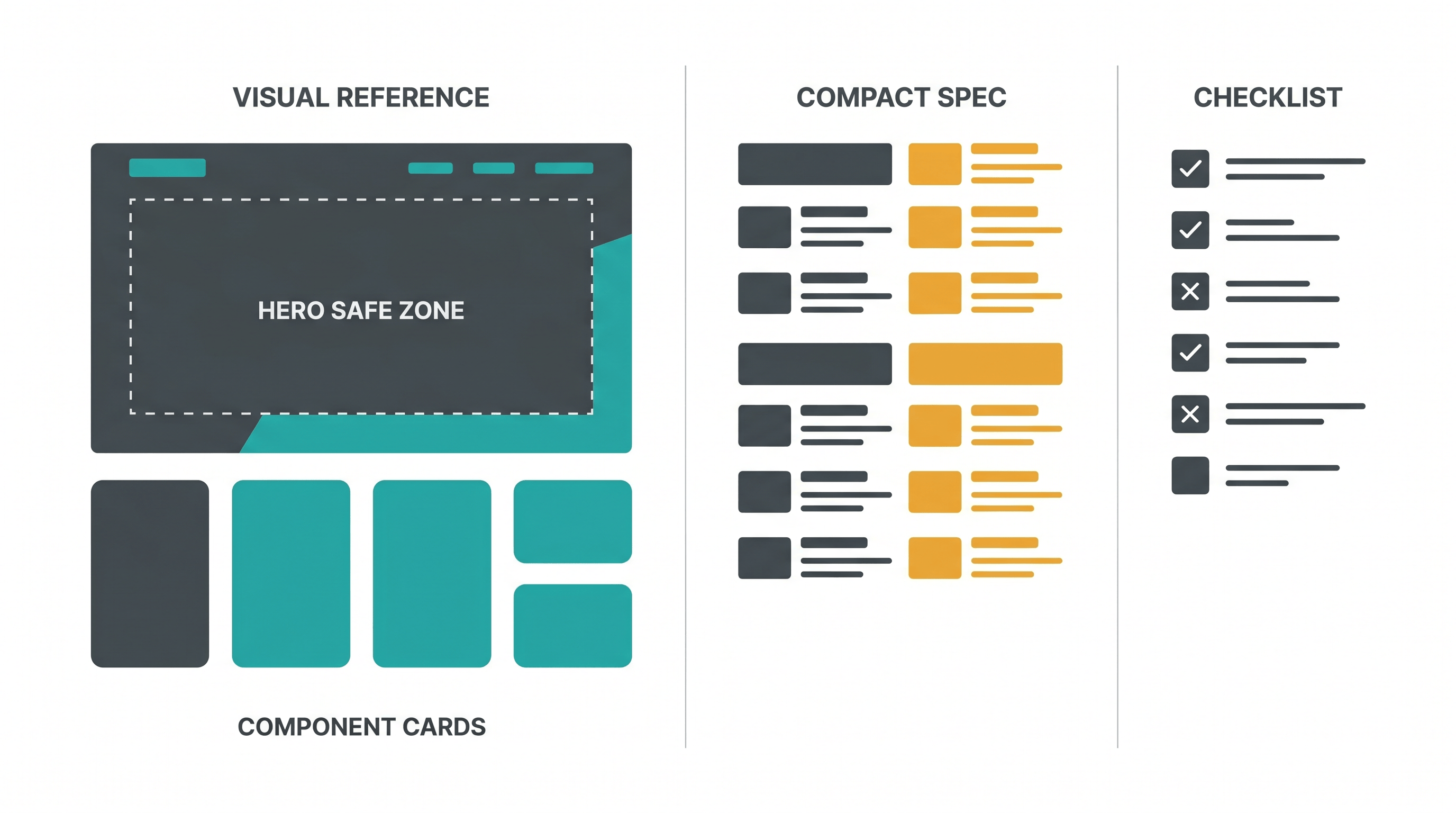
A strong landing-page visual reference explains three kinds of intent at once: layout intent, style intent, and component intent. A weak reference only shows a pretty direction; a strong one tells the model what to preserve, what to polish, and where it can invent details.
| Reference element | Weak version | Strong version |
|---|---|---|
| Layout | "A SaaS landing page" | Hero, proof bar, 3 feature cards, workflow strip, pricing, FAQ |
| Style | "Clean and modern" | Dense B2B SaaS, off-white background, dark text, muted accent color, no oversized hero |
| Components | "Add sections" | Testimonial carousel, comparison table, sticky CTA, pricing toggle |
| Image zone | "Put an image on top" | Right-side product mockup, 16:10 crop, leave headline-safe space on the left |
| Constraints | "Make it responsive" | Keep hero under 70vh, show next section on first viewport, cards max 3 per row |
The best references usually come from rough wireframes, screenshot mashups, mood boards, or low-fidelity sketches. The point is not artistic finish. The point is giving the model a visual contract. If the reference says the hero image must sit on the right and the pricing section must stay compact, the downstream AI has fewer degrees of freedom to waste.
For landing pages, your reference should show the page's conversion logic, not just its surface. A good reference answers: what does the visitor see first, what proof appears before the first CTA, where does the product become concrete, and how does the page lower risk before asking for signup?
Step-by-Step Guide
The fastest way to build an AI visual reference for landing page design is a six-step loop: define the page job, sketch the structure, label the intent, render a cleaner reference, package the prompt, then iterate from a change log. A single landing page reference can be ready in 15-30 minutes.
Step 1: Define the one job of the landing page
Write one sentence that names the page audience, the product category, and the desired action. For example: "This page sells an AI meeting notes tool to solo consultants and should get visitors to start a free trial." Keep it narrow. If you ask one page to sell, educate, recruit affiliates, and explain the company story, the AI will flatten the design into generic sections.
Expected result: a one-sentence page job and one primary CTA.
Step 2: Make a rough wireframe before writing a long prompt
Draw the page as blocks. Use rectangles for sections, circles for images, arrows for flow, and short labels for content. Spend five minutes. The sketch only needs to show hierarchy: hero, trust strip, problem, solution, workflow, proof, pricing, FAQ, CTA. This is the first draft of your landing-page reference, even if it is messy.
Expected result: a readable page map with section order and rough proportions.
Step 3: Label layout, style, and component intent
Add short notes directly on the sketch: "headline safe area," "product screenshot," "3 cards max," "comparison table," "testimonial," "CTA repeated," "keep hero compact." These labels prevent the model from treating the reference as a loose mood board. Labels also help when the model can read OCR or when a human teammate reviews the prompt package.
Expected result: a marked-up wireframe that names what must be preserved.
Step 4: Turn the sketch into a polished visual reference
Now convert the rough drawing into a cleaner image that downstream AI can read. Upload the sketch to Sketch To and choose a product-friendly style such as a landing page, SaaS dashboard, or layout-controlled mockup. The point is not to create the final page. The point is to turn a rough drawing into a sharper AI visual reference for landing page design that makes layout, density, and style easier to understand.
If your page depends on exact UI structure, use the AI UI Mockup Generator from Sketch. If your page depends more on hero art, ad composition, or a text-safe visual area, use the AI Layout Control Image Generator. Both keep the sketch as the starting structure while adding enough polish for a model or teammate to react to.
Expected result: one polished visual reference image, plus the original sketch for comparison.
Step 5: Package the reference with a short written spec
Attach the visual reference and write a compact prompt. Tell the model which parts to preserve, which parts to improve, and what output you want. Avoid a 1,000-word prompt that fights the image. A strong prompt says: "Use the attached AI visual reference for landing page design as the layout source. Preserve section order and hero composition. Improve spacing, copy clarity, and responsive behavior."
Expected result: an image plus a 200-400 word spec, not a giant prompt.
Step 6: Iterate with a visible change log
After each AI draft, record only the changes that matter: "hero too tall," "proof too late," "pricing cards too large," "CTA missing after workflow." Update the sketch or prompt with those corrections, then run another pass. This keeps iteration cheap because each run starts from a clearer reference instead of a new guess.
Expected result: two or three controlled iterations instead of ten unfocused rewrites.
Prompt Template
A prompt for an AI visual reference for landing page design should be short, explicit, and visual-first. It should tell the model what the reference controls, what the written brief controls, and what can be redesigned. This split prevents the model from either copying blindly or ignoring the image.
Use the attached AI visual reference for landing page design as the main layout guide.

Goal:
Create a landing page for [product] aimed at [audience]. The primary CTA is [action].

Preserve from the visual reference:
- Section order and approximate vertical rhythm
- Hero composition, image placement, and headline-safe space
- Component types: [feature cards, proof strip, comparison table, pricing, FAQ]
- Overall density: [compact / editorial / product-led / technical]

Improve:
- Real copy, not placeholder text
- Responsive layout for desktop and mobile
- Accessibility: readable contrast, clear buttons, semantic headings
- Component consistency and spacing

Avoid:
- Oversized hero that hides the next section
- Generic stock-art feel
- Replacing the product mockup with unrelated imagery
- Adding sections that are not in the reference unless needed for conversion

Output:
[HTML/CSS, React component, Figma-ready description, image prompt, or design critique]
Use the same template for text-to-code, text-to-image, and design-review models. The output field changes, but the reference contract stays the same. When the model drifts, point back to a specific instruction: "Preserve the hero composition from the reference" is easier to debug than "make it closer."
Pro Tips for Better Results
Small reference changes often beat long prompt changes. The best landing-page reference is not the prettiest image; it is the image that removes the most ambiguity from the next model call. Clean section boundaries, labeled intent, and realistic density matter more than decoration.
- Keep the first viewport honest. Design the hero so a hint of the next section is visible on desktop and mobile. This prevents AI-generated pages from becoming poster-like screens with no scroll cue.
- Use text-safe zones. If the hero needs a headline on the left, leave that area visually calm in the reference. Models often place busy imagery behind copy unless the safe zone is obvious.
- Show component density. A B2B tool page and a creator-tool page may both use cards, but the spacing and information density should differ. Draw that difference.
- Annotate conversion moments. Mark the first CTA, proof before CTA, and the point where the product becomes concrete. AI models are good at decoration; they still need help with persuasion sequence.
- Compare against the original sketch. If the polished reference looks better but loses the original hierarchy, go back. The sketch is the source of intent; the polished image is just a clearer carrier.
When not to use a visual reference
An AI visual reference for landing page design is most useful when layout and style need control. Skip it when the page is primarily copy strategy, when you need a technical architecture plan, or when the reference would bias the model toward a layout you have not validated.
| Situation | Better input than a visual reference |
|---|---|
| You are still deciding the offer | Positioning brief, customer notes, competitor table |
| You need copy variants | Message hierarchy, objections, proof points |
| You need production code quality | Existing component library, design tokens, acceptance criteria |
| You need analytics fixes | Funnel data, scroll depth, event logs |
| You need legal or compliance review | Exact policy text and required disclaimers |
References are powerful because they narrow the model's choices. That is also their risk. If the sketch is wrong, a better render only makes the wrong structure more convincing. Use a visual reference once you know the page job and the rough conversion sequence.
FAQ
What is an AI visual reference for landing page design?
An AI visual reference for landing page design is an image, sketch, wireframe, or polished mockup used to guide an AI model's layout and style decisions. It gives the model visual constraints such as section order, component placement, spacing, and image areas before it generates a page.
Do I need a polished mockup before using AI to design a landing page?
No. A rough sketch is enough to start, but a polished reference is easier for downstream AI to read. The practical workflow is to draw a quick wireframe, turn it into a cleaner visual with a tool such as Sketch To, then use that image as the reference for coding, image generation, or design review.
How detailed should the visual reference be?
Use enough detail to show structure and intent, not every pixel. A strong AI visual reference for landing page design shows section order, hero composition, CTA placement, content density, and major components. Leave final copy, responsive rules, and component implementation to the written spec.
Can AI visual references reduce landing page iteration cost?
Yes, when the model can read images and the reference is specific. The June 2026 Kimi vs Claude landing-page experiment reported much lower iteration cost for Kimi when high-quality visual references were used. Your exact savings will vary, but fewer ambiguous prompts usually means fewer discarded drafts.
Should I use screenshots from competitor sites as references?
Use competitor screenshots for analysis, not direct copying. Extract patterns such as section order, proof placement, pricing density, or hero framing, then redraw your own sketch. This gives the model useful structure without turning the page into a clone.
Which Sketch To tool is best for landing-page references?
Use Sketch To when you want to turn a rough sketch into a polished visual reference quickly. For product interface sections, start with the AI UI Mockup Generator from Sketch. For hero composition and text-safe visual areas, start with the AI Layout Control Image Generator.
Conclusion
The fastest AI landing-page workflow is not "write a bigger prompt." It is "make intent visible." Start with the page job, sketch the section sequence, label the parts that matter, turn the sketch into a stronger reference, and then ask the model to build from that reference. A good AI visual reference for landing page design reduces guessing at the exact point where AI design work usually becomes expensive: repeated visual trial and error.
Ready to turn your landing-page sketch into a stronger visual reference? Try Sketch To free -> Create a polished AI visual reference for landing page design from a rough drawing, then use it to guide your next AI design or generation prompt.
Transform Your Images with AI
Turn sketches into stunning images, remove backgrounds, swap faces, and more — all powered by AI.
Try Sketch To FreeShare
Sketch To
Tech writer covering AI tools, image processing, and creative workflows.
Related Articles

Knitted Doll AI Prompt: 7 Templates That Work
Use this knitted doll AI prompt guide to turn photos or sketches into cozy yarn dolls. Includes 7 templates, material words, and fixes.

Claude Design Workflow: Pair It With Sketch-to-Image AI
Build a faster Claude design workflow: use Claude for ideation and copy, Sketch To to render sketches into images, and Figma where it still wins.

Sketch to Image AI Layout Control: A How-To Guide
Learn why sketches give stronger layout control than text prompts. A step-by-step sketch-to-image AI workflow for design-ready images.